To get started with eForm, you will need to create a form first. The system comes up with a few forms pre-installed and you can check them out if you want a quick start. For in-depth informaiton, please read this.
Access the form builder
![]()
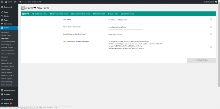
To create a new form through form builder:
- Go to WP Admin > eForm > New Form.
- Select a template or start from blank.
- Give a name and change other settings.
- Click on create form.
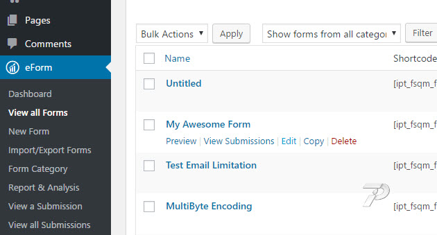
To edit an existing form through form builder:
![eform-edit-form]()
- Go to WP Admin > eForm > View all Forms.
- Hover on the form you’d like to edit.
- Click on Edit.
In both the cases, the form builder will start showing on your screen. Throughout the tutorial, we will assume you are creating a new form.
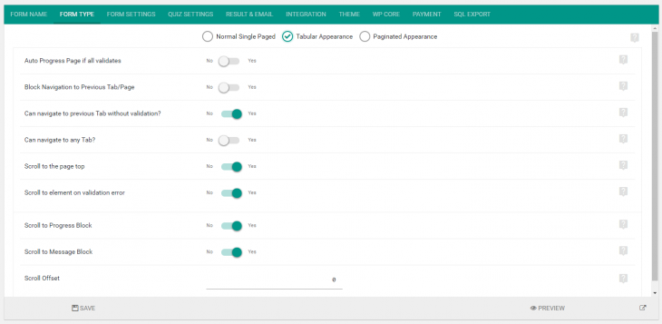
Form type
![]()
Click on Form Type and select preferred type.
Normal Single Paged
- Form will appear with a general single paged layout.
- Ideal for small bussiness or contact forms.
Tabular Appearance
- Form elements can be grouped into tabs.
- A user will need to navigate through all the tabs and fill them up before submitting.
- You can create as many tabs as you want. Simply click on the Add Tab/Pagination button.
- You can also select if the user is able to navigate to a previously viewed tab without validating or completely filling the form elements inside the current tab.
Paginated Appearance
- Form elements can be grouped into pages.
- A user will need to navigate through all the pages and fill them up before submitting.
- You can create as many pages as you want. Simply click on the Add Tab/Pagination button.
- You can select to show a progress bar which will show the percentage of completion.
Some useful Settings
Here are some useful settings for each form types.
- Wrap Inside: Works for simple form appearance. If disabled, then the shadowed container won’t be shown.
- Block Navigation to previous Tab/Page: For Tabular & Paginated appearance. If enabled, then the previous action won’t work.
- Can Navigate to any Tab: If enabled then user can freely navigate to any tab for tabular appearance.
- Scroll to the page top: If enabled then the page will scroll to the top of the form when changing pages/tabs.
- Scroll to element on validation error: If enabled, then page will scroll to the element which has caused some validation error.
Adding Containers
To get started with elements, you will need to add containers first. Containers are top level wrappers of form elements, which intends to do the followings:
- Create tabs for Tabulated Appearance.
- Create pages for Paginated Appearance.
- Create blocks for Normal Single Paged Appearance.
Simply click on the Add Containers button located on the bottom right of the screen. You can add as many as you want, anytime you want. For now, let’s just focus on one.
Once you have added, click on the Cog icon and it will bring the configuration options. Set a title, secondary title and some description and hit save.
Adding Elements
Now the fun part. eForm elements are categorized in 4 types.
- Design & Security.
- Multiple Choice Questions.
- Feedback & Upload.
- Other Form Elements.
Each of the types has its own set of form elements. Just click any of the category and the list will popup. From then, you can either click on an element, or drag it to the newly added container.
For now, we simply add a Single Option element from Multiple Choice Questions.
When you add an element, some the options will be preconfigured. This is to help you get started quickly. But all of them can be customized.
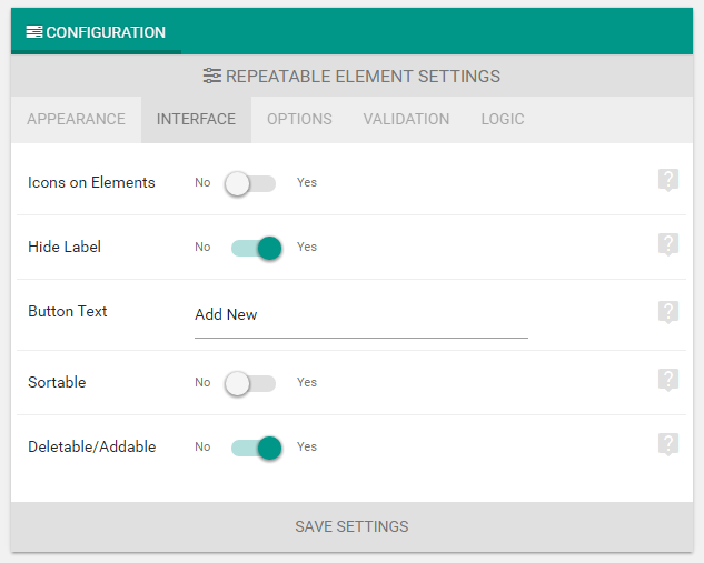
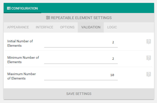
Configuring Elements
Each element has its own configuration options. The common ones are:
- Element title: Show a title to the element.
- Element description text: Show a secondary title to the element.
- Label Alignment: Make the title show above or aside the element.
- Description: Richtext description to further customize element description.
Besides these, there are many other options which we will see in future.
Rearranging Form Elements
- Simply drag and drop elements throughout the layout to rearrange them.
- Drop over a container tab to place to the specific container.
- Drag and position containers tabs to rearrange them.
Duplicate Form Elements
- Click on the copy button to duplicate an element.
- Click on the copy icon of containers to duplicate an entire container.
Delete an Element or Container
- Drag an element and drop to the bottom to delete an element.
- Click on the delete button to delete an entire container.
Saving and Previewing Form
Once done editing, click on the big Save button. It will save your form. Then click on the Preview button to preview it.
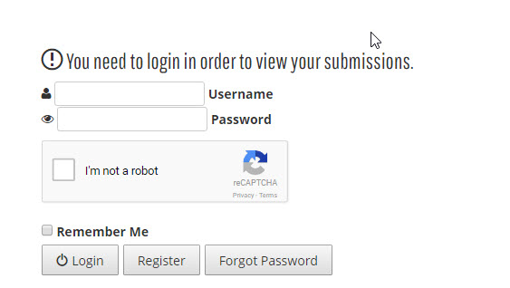
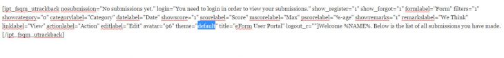
The post Creating your first form through eForm appeared first on WPQuark Knowledge Base.


